Dashboards
I make dashboards in Plotly Dash to explore datasets and simulate models interactively, in a way that can be shared with collaborators. My publicly available dashboards are listed below.
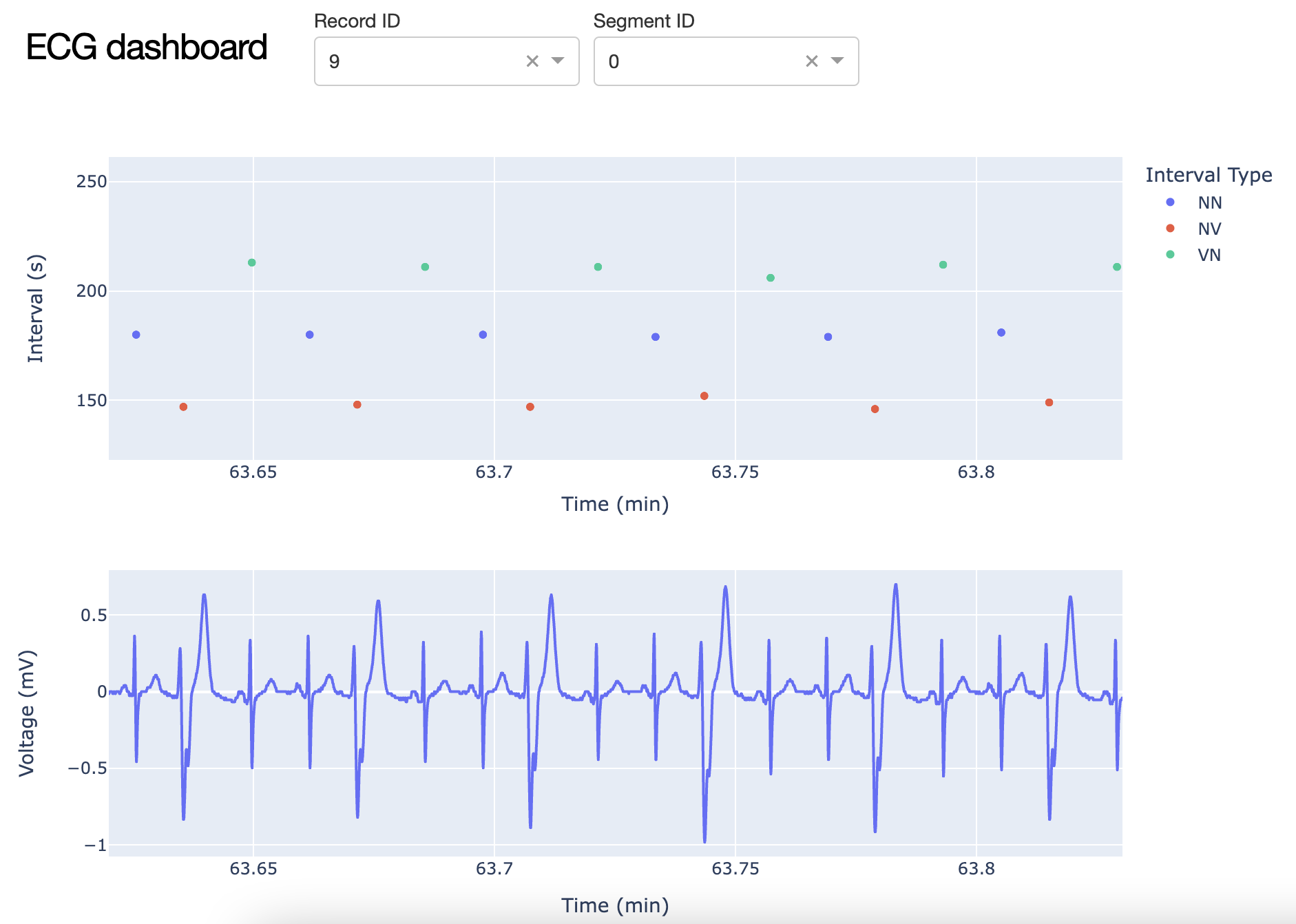
Visualisation of ECG data on Physionet
This app streams and plots data from the Icentia11k database on Physionet, which contains data from 11,000 patients who have undergone a Holter recording (ambulatory ECG). I have a step by step tutorial on Towards Data Science on how to create this app.
Run app
Github repo
Tutorial
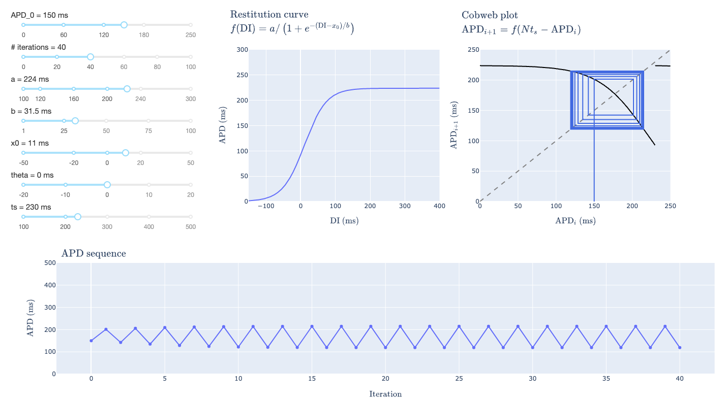
Restitution curve analysis
This app simulates and plots output for a model of a periodically paced cardiac cell based on properties of its restitution curve, which the user can modify.
Run app
Github repo
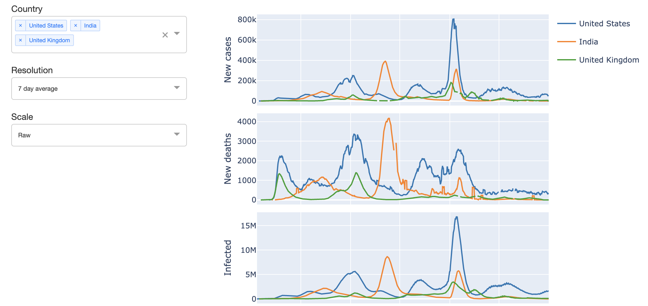
Covid-19 visualisation and analysis
This app displays Covid-19 cases and deaths for a given country, and computes approximations for the total number of infected cases and the contact ratio. Uses the dataset from Our World in Data.
Run app
Github repo
Dr. Thomas Bury
Assistant Professor, Dept. of Mathematics
Specializes in nonlinear dynamics and machine learning applied to the natural sciences.